

Complementary Color Wheel
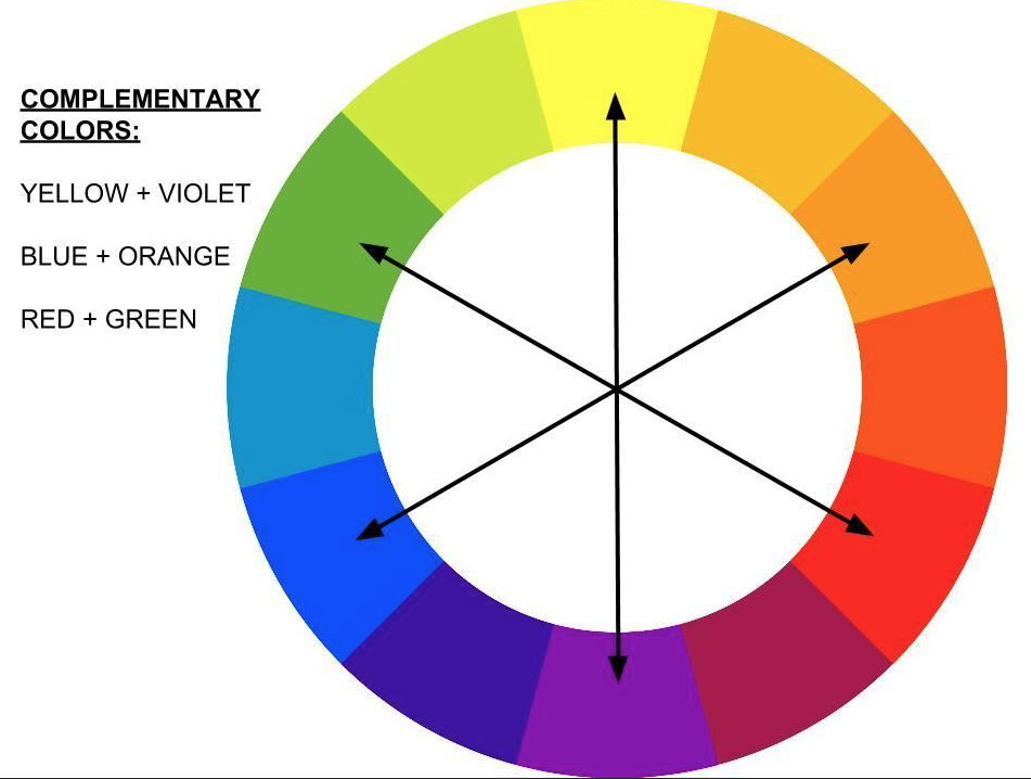
Clothing color choice is something I talk about all the time with my clients. With most people wanting outdoor sessions, nature is part of the background. In my previous posts on achieving aesthetically pleasing portraits, I have touched on color harmony. It is also helpful to know complementary colors. The above chart is a great place to start.
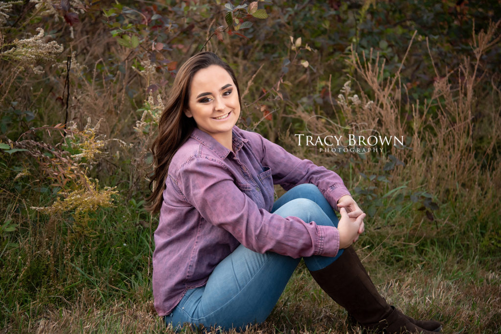
I love Samantha’s choice of purple. Not only were we able to find a little purple in the background, but there are yellow hues, which aligns with the color chart.
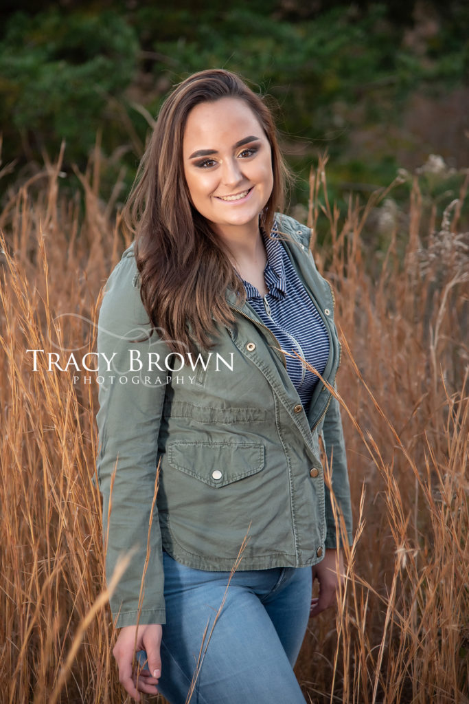
Above we have some blue and orange tones shown on the chart. The orange hue in wheat field brought to us by the ever popular the golden hour glow! We can achieve different looks at different times of the day with the sun’s color temperature. Cool pink and blue tones are typical with sunrise, and warm golden tones for sunset. I love how the warm sunset provided a beautiful natural hair light glow!
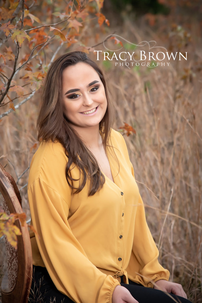
Yellow is such a pretty color in outdoor environments, and Samantha’s beautiful skin tone certainly added to the harmony!
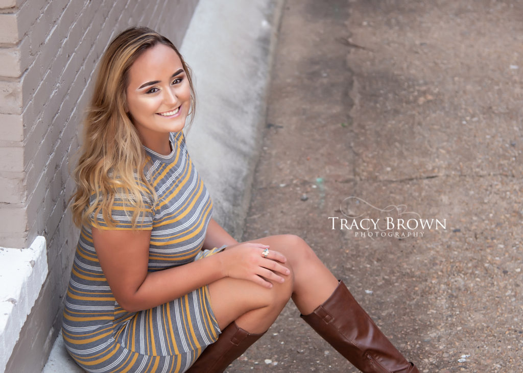
Though not on the color chart, we’ve all seen the popularity of yellow and gray. I just love how Samantha is glowing in the portrait! The “highlight” make up trend is so popular, so using a reflector light source, I was able to capture this for Samantha. Hair and make up are important to lots of High School Seniors, and with Samantha’s career choice, we most definitely made it a priority! Samantha is one of the sweetest girls ever! I feel like we captured her beauty, personality, and style! This girl is a motivated graduate, and now doing what she loves as a thriving stylist at https://www.winningimagesalonanddayspa.com
I hope you found a helpful nugget to help you improve your photography!
March 19, 2020


Comments Off on Complementary Color Wheel